Previous logo
My name is Alex Tomlinson, I work for the National Audubon Society and illustrate and design in my free time. I was contacted awhile back by board member Namit Saksena who was interested in an updated look for the San Francisco Bay Wildlife Society. As soon as I saw the Avocet chicks I knew this was something I wanted to work on! Namit got me up to speed about the great work the Wildlife Society does for the country’s largest urban wildlife refuge and what kind of work they were looking for. Below is a small look into what the process looked like.
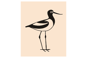
The original avocets were beautifully illustrated. Similar to something you might see in a field guide. Unfortunately, a field guide illustration does not usually make for a great logo. Fine details do not read clearly across social media avatars, video watermarks, or embroidered patches. A simpler, more symbolic logo would read more clearly and be easier to take ownership of. (Imagine if Mickey Mouse was a photorealistic illustration of a mouse!)
My main goals for the update were:
- Maintain the logo heritage built up over many decades
- Make life easier for people who work with the logo
- Donate my time to an important cause
Within a few sketches the mom and chick began to notice each other!
Early sketches (gif)
In the interest of making the logo easier to work with I utilized a container shape. This makes using the logo on photos and videos much more simple. It also provides an opportunity to use colors outside of the avocet palette. Personally I feel that most new logos are too optimized for social media. The standard 1:1 avatar crop has created a lot of similar looking logomarks. I was attracted to the superellipse (not a rounded rectangle!) as it’s a friendly shape that holds the illustration very well. It also feels less digital because you can’t just draw a superellipse in most illustration software.
Early color options with old acronym
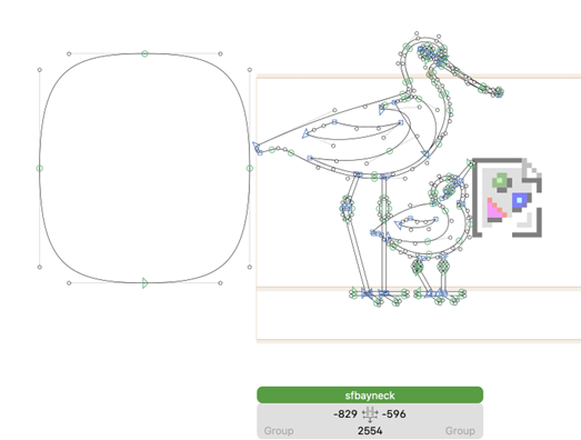
After sketching I refine the vector paths in Glyphs. This is technically a font editor- but in my opinion it’s the best vector drawing tool out there!
Early type options
The previous font choice presented similar issues as the illustration- it was too thin to read clearly at small sizes. I explored options for something bold and authoritative- yet friendly- but avoiding anything in the “friendly serif” category which has become the standard for tech and pharmaceutical startups in the last decade. We eventually landed on Arizona Flare which I feel strikes the right tone and should have more lasting impact than trendier options.
Updated logo featuring Arizona Flare
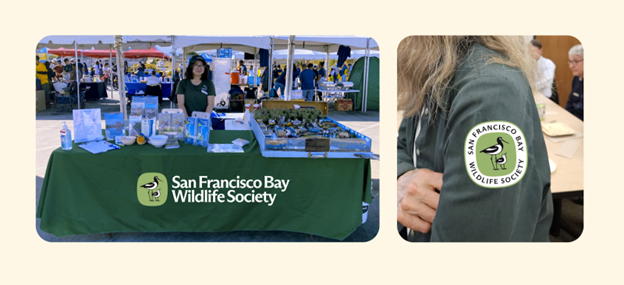
Finally, a logo does not exist in a vacuum. To understand how well it works or doesn’t, stakeholders need to see it in use! These mockups helped myself, board members, and volunteers figure out what colors and details felt right.
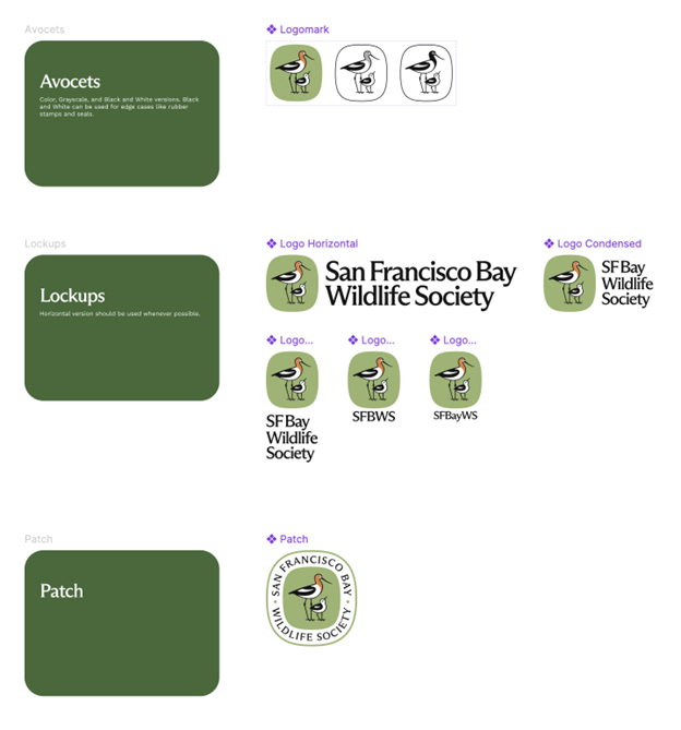
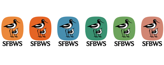
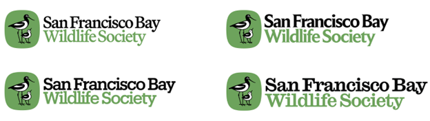
The longer an organization’s name, the more variations you need!
I am incredibly happy with how this project turned out. Thank you for reading and thank you to the San Francisco Bay Wildlife Society for thinking of my work!
This is a guest post by Alex Tomlinson, an Pennsylvania-based illustrator who works with the National Audubon Society. Check out more of Alex’s work on his website, alextomlinson.com.